Industry
Top 4 industries that need ManageArtworks for artwork management
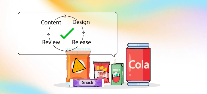
Discover how ManageArtworks streamlines packaging workflows across FMCG, pharma, cosmetics, and spirits, ensuring accuracy, compliance, and efficiency with AI-powered proofing, centralized asset management, and real-time collaboration tools.


.png)


.jpg)
.png)


.png)


.jpg)
%20(1).jpg)

.jpg)
.jpg)
.jpg)


.png)